
FRASER
MUGGERIDGE


My own experimentations with font layering - inspired by a chaotic system.
Fraser's talk touched on many points, from artist development, working with clients, and how to make decisions regarding the artwork that you are making. Not being a graphic designer myself, it was a fresh and interesting perspective into how his designs are created, especially with his detailed look at the artwork for Hot Chip's album, A Bath Full Of Ecstacy.
In regards to systems, the alphabet is a system of communication. The font is a redesign of the alphabet, designed to make the system work in a way that compliments the message communicated. However, whichever font is chosen has to relate to the current, contemporary alphabet so that the message can be carried across to the reader. While the title of this page is a hectic collection of different font, thrown together with all the cunning and savvy of a wet paper towel, it is legible because it relates to typography, uses the correct lexicon, and vaguely expresses the theme of this week's conversation - systems of graphic communication.
The big blue illustration (top right) is the updated Utopian alphabet with all of modern English's 26 letters.
Above is the original Utopian alphabet with only 22 letters. Utopian is, like all languages now I think about it, a made-up language. It existed in Sir Thomas More's book about a made-up island, Utopia.

‘If a man wears eighteenth-century dress today, or wears his hair down to his shoulders, or builds Gothic Mansions, we very likely call his behaviour odd; it does not fit our time. These are abnormalities. Yet it is such departures from the norm which stand out in our minds, rather than the norm itself. Their wrongness is more immediate that the rightness of less peculiar behaviour, and therefore more compelling. Thus even in everyday life the concept of good fit, though positive in meaning, seems very largely to feed on negative instances; it is the aspects of our lives which are obsolete, incongruous, or out of tune that catch our attention.’
Christopher Alexander, Notes on the syntesis of form, 1964
The developments in typeface design, typesetting and printing have always been aimed at the improvement of “quality”. Compared to printing techniques as they existed in the early 15th century we have indeed come a long way.[1] Technically we can create the slickest printing ever, reach the highest possible quality ever. Unfortunately, the results have too often become absolutely boring. The quality of a printed product, the high resolution of its typefaces, the perfect printing are not necessarily what makes for good design or clear communication.[2] At some point during the development of type and typography, the graphic design industry decided that is was necessary to improve upon the “quality” of printing and type. In the process due to economic and commercial considerations, much vitality was lost. We believe that the computer, although considered by many to be cold and impersonal, can bring back some of these lost qualities.[3] The modern worker lacks individuality.
Erik Van Blokland, Is Best Really Better, 1990


Layering similar fonts on top of each other, in order to create a new font. Approximations of each letter and tone difference give the font depth. These are 3 existing fonts, layered and substracted from each other, leaving this result.

First

Second
Larger examples, with the same fonts, in different orders. Altering the order of the fonts creates a dimension shift. I see the first as one word leaning on another while the second image reacts more like an angled shadow.


A more - brutal - example of font layering where the blending of each version is different.
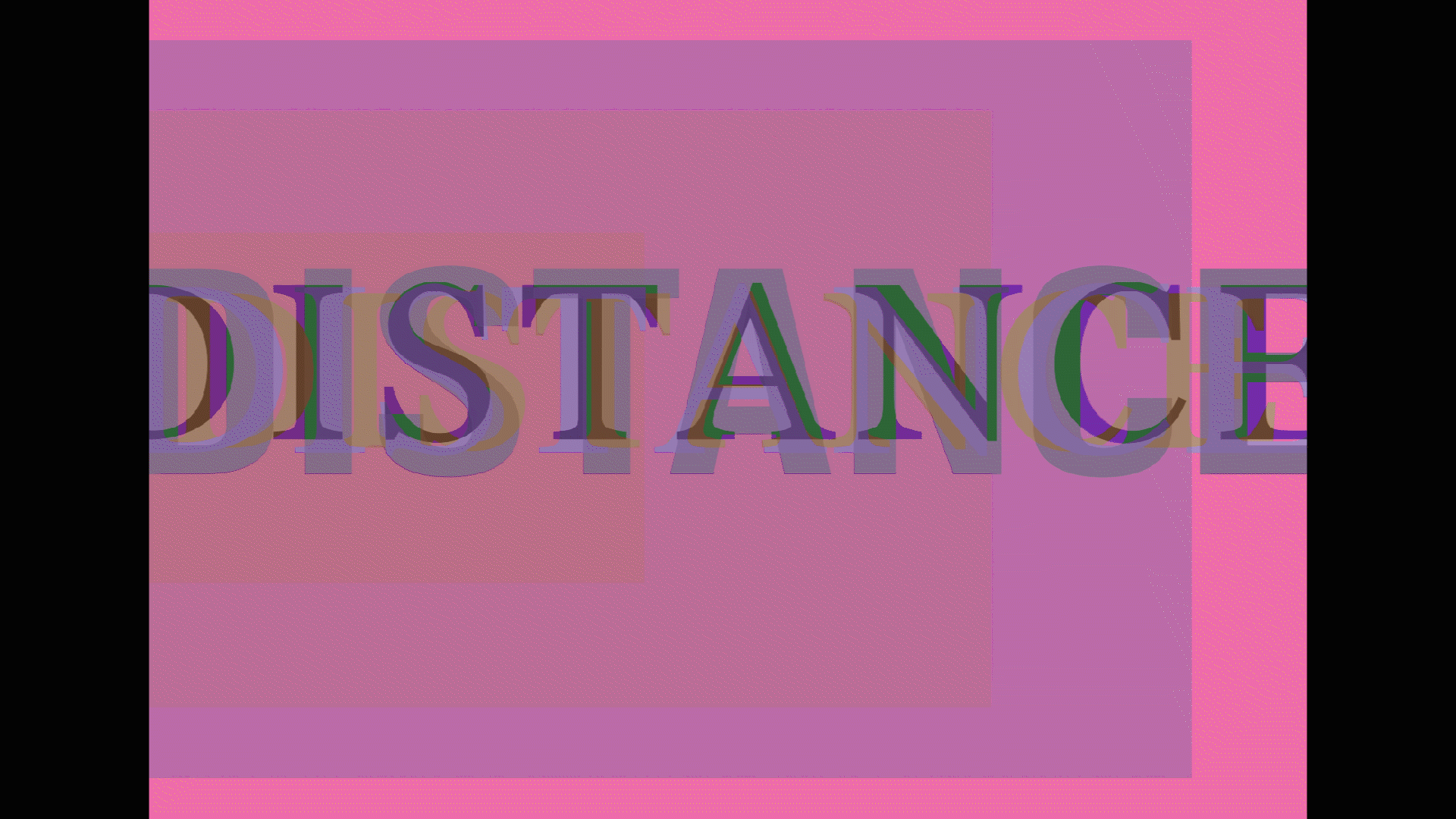
This GIF gives movement to an array of images.


Typography was quite a bit part of my Expanded Art Forms project. Luckily I had some time after Fraser's talk to hand it in, which gave me some time to think about how much I wanted to incorporate it as part of my project. Apart from the slides above, you can check out the rest of my typographic work for the Expanded Art Forms project HERE.